New corporate website features
Fastw3b team is happy to present our new corporate website with a new design and numerous features for better user experience and comfort work with Joomla! extensions and services. Among the others we want to highlight documentation, product page, client section, overall design and mobile version.
Documentation
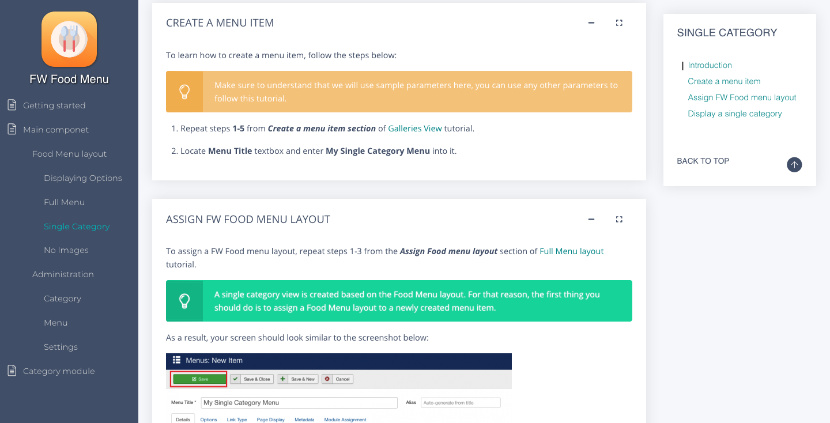
There were requests for a more comprehensive documentation and we can now respond to them. Check out totally new solution with detailed description for every product we offer on our website. Most of the products contain more that one extension. Every item is documented as a configuration process, starting from basic aspects up to advanced features. We added a tree-like contents menu and a search bar for easier navigation. Ask a question form and review buttons were added to make documentation update and development an interactive process with a feedback loop.
Product Page
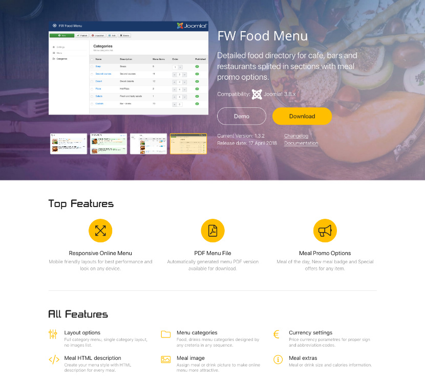
As our products evolve we needed a cleaner presentation for packages we provide with their main features, translations available and items included. We regrouped some information in the header to provide product key information in one place, and added atmospheric background to emphasize screenshots slideshow. To show our appreciation for JED reviews, some of you published, we decided to add review section and extend it with new posts along the way.
Client Section
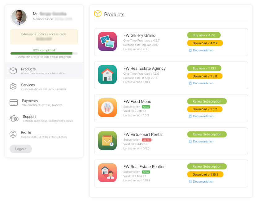
Customer care has always been our priority. Client Section is the main tool for our customers to keep a track of extensions and services progress as well as to get support in case of need. All communication goes through this section and we did our best to make every page of this area clean and intuitive. We completely reworked brief profile information and combined it with a side menu. We bet you will like it.
Design
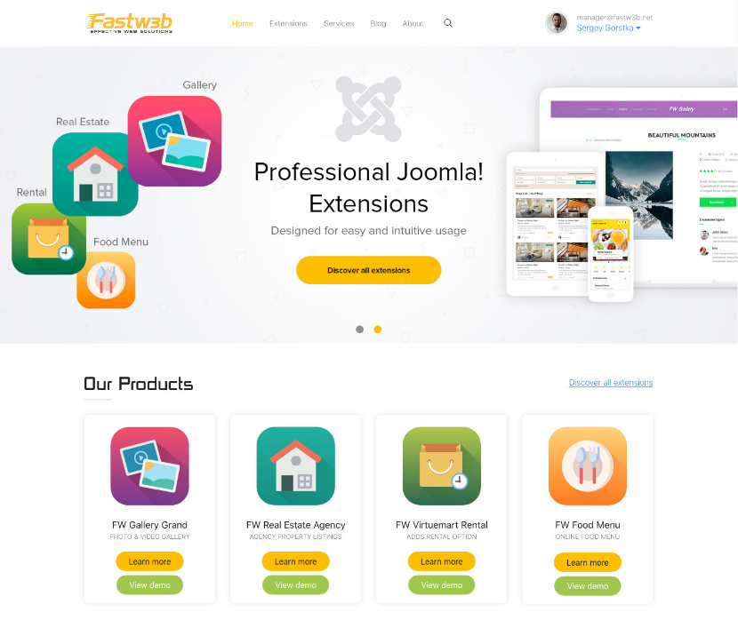
New concept was supposed to be a slight redesign of a previous version. But what started as a small change turned into much bigger update with every new page design. After new concept was born a fresh look at existing pages gave us even more ideas and eventually we needed to stop adding new changes and implement what we had already. Take your time to browse through pages and explore all new things we added to our corporate website.
Mobile Version
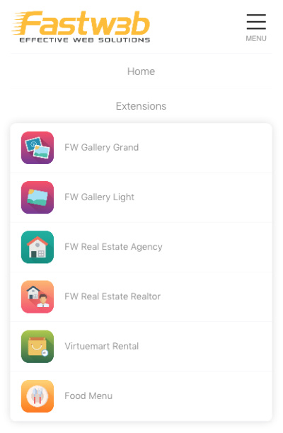
Smartphone screens are getting bigger and share of mobile browsing goes up. Even using responsive Bootstrap 4 framework we did extensive testing on mobile screens to make sure new design looks as good as on desktops.
With new version launched we still find little things find here and there and continue improvements of our new website. If you find something that doesn't look nice or you have an idea how it can be implemented better, please, don't hesitate to share it with us via client section support or simply by clicking Customer Care button at the bottom. At the same time if you just want to share your feedback feel free to write via Support section in your account or social networks.
