This release was basically centered around a new menu design. Along with that, there were a series of new features and updates. Let’s review all changes below:
- New menu front-end design. We have updated a menu design. A new modern and clean menu design is perfect for multipurpose restaurant use.
- New design for promo options (New, Meal of the day, Special). We have updated promo icons and boxes to make them look even more appealing and attractive.
- New 2 columns menu layout. Now your menu can be arranged in two columns to make it look more organized and structured.
- New Menu Layout options for a menu item. We have updated menu layout options to add more flexibility to a menu item display.
- New FWFM Meal Categories Module. This feature is especially helpful for those who want to display their menu in a module. FWFM Meal Categories Module has the same settings as the component - choose the categories you want to display, set two columns menu, display PDF download button, etc.
- New multi-price feature. Configure a pricing grid for a separate menu position - set different prices for different portion sizes.
- New price discounts option. This option allows to apply a discount to a specific meal. Discounts can be used in pair with promo options for more effective promotion.
- Revised admin panel. We have updated admin panel design. Now it looks cleaner.
- Revised PDF option. An updated PDF option allows to upload a full menu PDF file instead of generating it live. Earlier, it took too much time to wait for online generation and often had design issues.
- Joomla 3.9.x compatibility. We have tested the component with Joomla 3.9.x.
Get familiar with FW Food Menu documentation to find more information about our product. Please use the comments section at the bottom of each documentation page to comment and suggest improvements that will make the product experience better.
Beauty industry websites are all about visual presentation of products and services to the audience. All websites dealing with presentation can be created based on galleries. FW Gallery is a powerful tool for visual presentation. There are many different types of beauty industry websites in the marketplace - spa salons, nail bars, skin care shops, hair design studios, and many more. In this article, we will review a professional and good-looking hair salon showcase created with FW Gallery.
The showcase is dedicated to a specific kind of salon services - hair design. However, you can use any other beauty industry direction instead of the hair design. If you are offering different range of salon services at one place, then each direction should be configured separately, similar to the hair salon showcase.
We will describe each page of the hair salon showcase, its elements, and business idea behind each element. Make sure to understand that to proceed with creating the same website you need to prepare media content and install FW Gallery to your Joomla platform. To learn how to get started with FW Gallery, review Getting started documentation page. If you have media content and FW Gallery in place, it takes around one hour to build the same website. The overall process for creating such a website looks as follows:
- Prepare media content - photos and videos grouped by services.
- Install FW Gallery to present your services with a clean design.
- Create required galleries to show service categories and different types of products inside them.
- Display all images to show services with their pricing, description and related products.
- Configure the slideshow module to create the atmosphere for each section and/or promote products/services.
- Configure the latest module to show related products for sale.
Check out our Hair salon guide for more details on configuring Hair salon showcase. Let’s, review the showcase page by page in the sections below.
Page with Salon Services Directions
If you are offering different kinds of salon services at one place, you need to create a page with multiple galleries. Each gallery will represent a specific service direction, for example, manicure, cosmetology, hair design, etc. However, if you are offering a specific service, you can skip this step.
We have created a Beauty industry page to showcase different beauty industry directions. The hair salon showcase is realized via galleries view. Each gallery on this page represents a particular direction of the beauty industry.
Salon services directions
Here you can see the following elements:
- Title of the parent gallery. We have created a Beauty industry parent gallery. If you are creating a website for a beauty salon offering different services at one place, there should be a title of the beauty salon.
- Description of the parent gallery. The description conveys general information about gallery content. We have provided general information about the beauty industry directions here. You can insert a mission of your beauty salon here.
- Subgallery. In our showcase, the subgallery represents a specific beauty industry direction. However, you can use a subgallery for each particular service type offered at your beauty salon.
- Subgallery video preview. Preview cover is an effective promotion tool. We have placed a video on the preview cover of the hair salon gallery to add more dynamics to the page. But there is a possibility to use the image as gallery preview cover. You can use both types on preview covers for different galleries on one page to make it look more entertaining.
- Subgallery title. We have specified the title of the showcase here. You can specify the type of services offered at your salon.
- Subgallery description. We have placed general information about services offered at the hair salon. You can also specify some general information about each service type or its price.
Page with Service Types
This page is a show window of the hair salon. It should be eye-catching and clearly laid out with an informative text message, logo, images, etc. It represents different types of services offered at the hair salon. To show all service types on one page, we use galleries view - one gallery for a specific type of services.
Page with service types
Here you can see the following elements:
- Subgallery title. We have entered the title of the showcase here. You can specify the title of service direction.
- Subgallery description. Our subgallery description includes:
- Text description. Mission of the hair salon.
- Image. Logo of the hair salon.
- Slideshow module. The slideshow of services to ensure effective promotion.
Specify a general description of the services here. You can also place different elements into the description area of the gallery, just as we did.
- Subgalleries of the Hair salon subgallery. Each subgallery represents the type of service offered at the hair salon. Use subgalleries for all types of services you offer for a specific direction.
- Subgallery image preview cover. We have used images as preview covers for the types of hair salon services. However, you can set either video or image preview covers for the subgalleries on this page. It depends on your media content and vision.
- Subgallery title. We have specified the title of the haircut here. You can specify the type of services offered at your salon.
- Subgalley description. We have specified an approximate price for a service type here. You can specify what’s included in the services and/or its price.
Page with Hairstyles
This page displays a lookbook of hairstyles done at the hair salon. It is realized via gallery view. The gallery view allows to show beautiful images of the hairstyles. It also provides a reference to the hair care products sold at the hair salon.
Hairstyles lookbook
Here you can see the following elements:
- Subgallery title. We have specified the title of the service here.
- Suggallery description. We have used this area for service description and its price.
- Images included to the gallery. These are the images of hairstyles. You can display the images of looks you have created for your customers.
- Images titles. We have specified the titles of the hairstyles and their prices here. You can specify the title of the look achieved using your services.
Page with a Single Hairstyle
On this page, we can see a strong association between a single hairstyle and hair care products sold at the hair salon. The page is implemented via a single image view. Single image view provides a detailed view of the product/service you are offering. It also allows to provide more details about the service/product through the elements outlined below.
- Image title. We have specified the title of the hairstyle here. You can specify the title of the look here.
- Ratings. Ratings encourage the activity of registered users. We use star ratings, but you can choose between stars, hearts or thumbs.
- Image section. This section displays the image of the hairstyle. You can display a look achieved using your services.
- Image description. Except for the hairstyle text description, we have added the latest module with hair care products to create a dependable line between the product and service. You can use the description the same way to provide additional information for a single image view.
- Slider. The slider allows to access the gallery with other hairstyles right by clicking the image within the slider, without going to the upper level. Use the slider to showcase other looks included to the gallery and simplify navigation.
Creating such a great website with FW Gallery is not difficult at all. If you like the concept of the website, you can create a similar one with your own hands. We have clearly outlined all steps required for creating such a website in our Hair salon guide. Should you have any problems while configuring the website, feel free to ask questions in the comments section at the bottom of the documentation page.
In this release, we have done a few bugfixes and updates to improve user experience with FW VirtueMart Rental. Let’s review all of the changes below:
- Layout styles update. We have removed some Booking form display failures, which resulted from previous totalBooking form design update.
- Rental price is 0 when the form is empty. Even though the dates are not chosen within the calendars, the total rental price is displayed as “0”. This feature brings more clarity to the price calculation process.
- Total price includes deposit price. Now if the dates are selected deposit price will be included in the total rental price.
- Deposit and Insurance fields display. Bug resulted in system titles display on the front-end. Now deposit and Insurance fields are displayed as text areas.
Get familiar with FW VirtueMart Rental documentation to find more information about FW VirtueMart Rental. Please use the comments section at the bottom of each documentation page to comment and suggest improvements that will make the product experience better.
Meet our new Documentation approach! Developing extensions we always considered a well-designed extension when no documentation is needed at all. At the same time a scale and complexity of products may vary and documentation can be very helpful to explain a concept and options for different layouts and configuration options.
Our decision was to build a space where user can browse and read peculiarities of products with the best comfort and tools. We came up with an idea to make it a unique environment with its own design to help focus on documentation only. New system has a public access to all its content. There are 2 ways to get into documentation space: product landing page or a Client Section -> Products area Documentation link.
Left-side contents menu and top search bar are the main navigation tools, while right-side document menu helps navigating through the document. Contents menu is built as a topic tree where each node is a document. All components, modules and plugins that are included in a product have their own pages. Top search helps to filter content by a word or phrase.
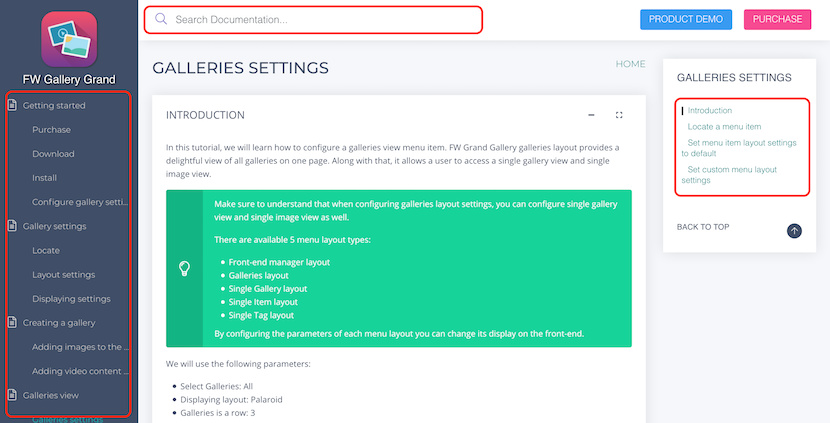
Document area is broken into separate blocks for the ease of scanning to find the right information with a side menu that helps navigating through the blocks. Every block has extensive markup elements to make documentation reading easier and intuitive.
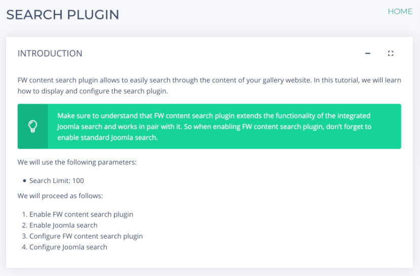
We added some interactive elements like Ask a question form to clarify information on the page or ask for additional information which was not provided. Was this article helpful buttons would allow us to evaluate if provided content was relevant or needs an update or replacement.
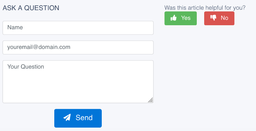
We hope you enjoy our new documentation system and will find answers to your needs easily. In case you don't don't hesitate to use Ask a question form for communication. You are very welcome to share your impressions from using documentation by leaving a comment below or sending a message via Support in Client Section.
Fastw3b team is happy to present our new corporate website with a new design and numerous features for better user experience and comfort work with Joomla! extensions and services. Among the others we want to highlight documentation, product page, client section, overall design and mobile version.
Documentation
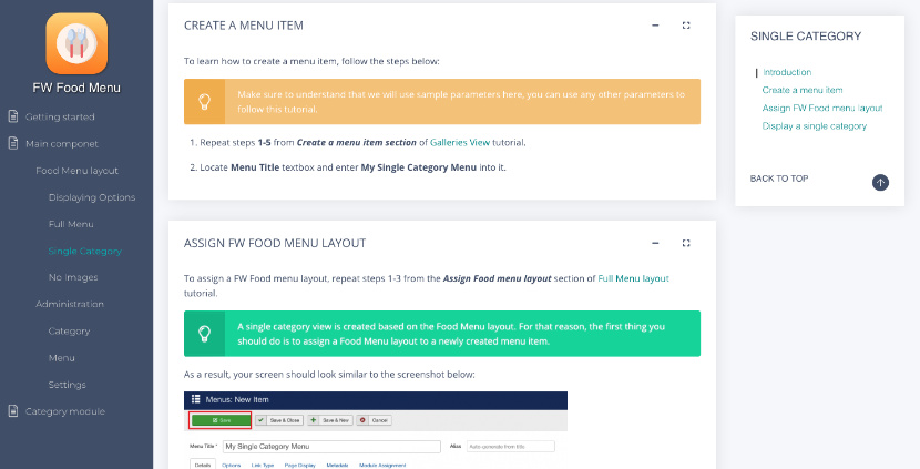
There were requests for a more comprehensive documentation and we can now respond to them. Check out totally new solution with detailed description for every product we offer on our website. Most of the products contain more that one extension. Every item is documented as a configuration process, starting from basic aspects up to advanced features. We added a tree-like contents menu and a search bar for easier navigation. Ask a question form and review buttons were added to make documentation update and development an interactive process with a feedback loop.
Product Page
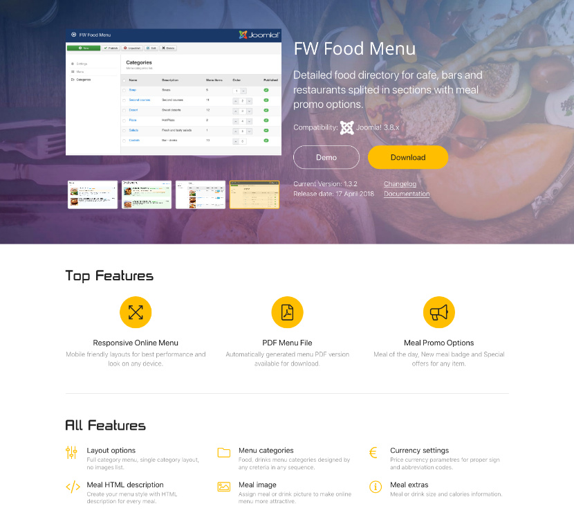
As our products evolve we needed a cleaner presentation for packages we provide with their main features, translations available and items included. We regrouped some information in the header to provide product key information in one place, and added atmospheric background to emphasize screenshots slideshow. To show our appreciation for JED reviews, some of you published, we decided to add review section and extend it with new posts along the way.
Client Section
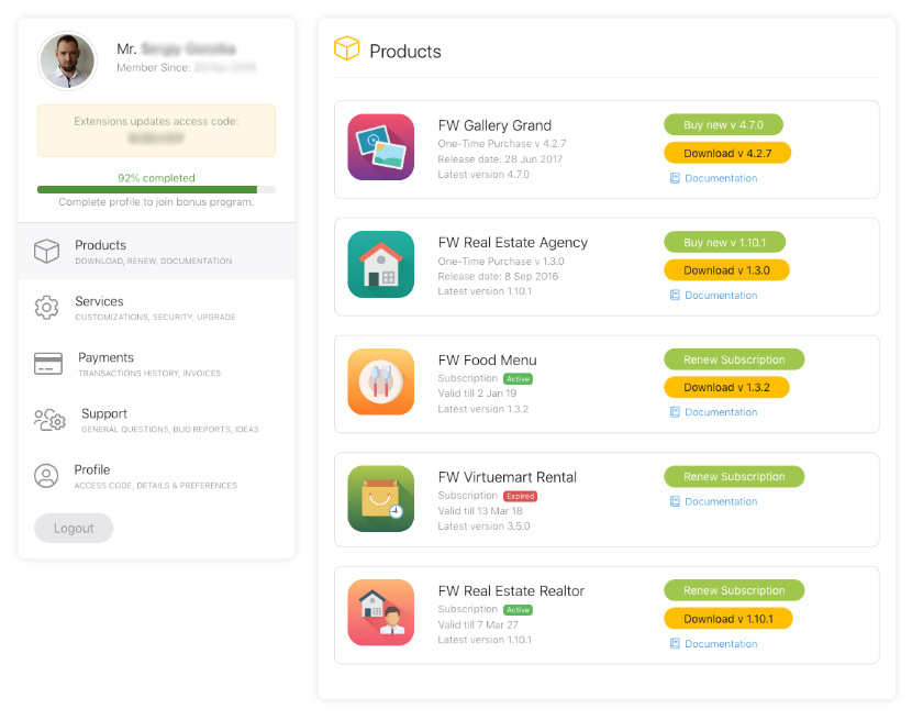
Customer care has always been our priority. Client Section is the main tool for our customers to keep a track of extensions and services progress as well as to get support in case of need. All communication goes through this section and we did our best to make every page of this area clean and intuitive. We completely reworked brief profile information and combined it with a side menu. We bet you will like it.
Design
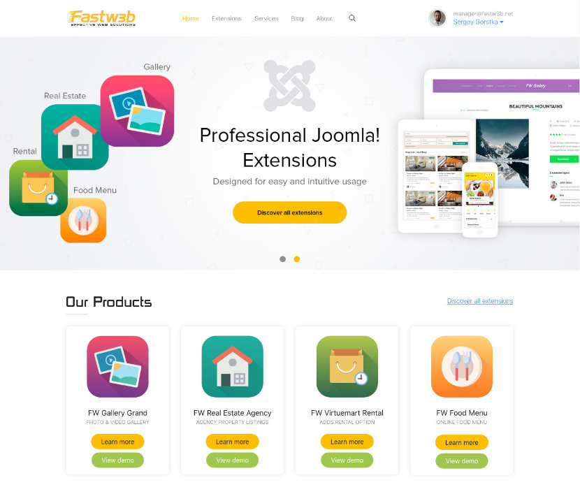
New concept was supposed to be a slight redesign of a previous version. But what started as a small change turned into much bigger update with every new page design. After new concept was born a fresh look at existing pages gave us even more ideas and eventually we needed to stop adding new changes and implement what we had already. Take your time to browse through pages and explore all new things we added to our corporate website.
Mobile Version
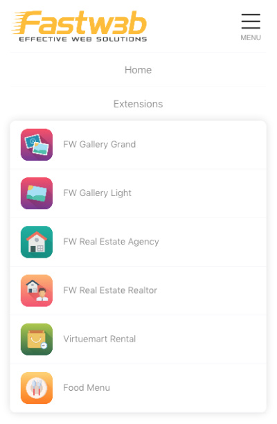
Smartphone screens are getting bigger and share of mobile browsing goes up. Even using responsive Bootstrap 4 framework we did extensive testing on mobile screens to make sure new design looks as good as on desktops.
With new version launched we still find little things find here and there and continue improvements of our new website. If you find something that doesn't look nice or you have an idea how it can be implemented better, please, don't hesitate to share it with us via client section support or simply by clicking Customer Care button at the bottom. At the same time if you just want to share your feedback feel free to write via Support section in your account or social networks.
Few days left in 2020 and we want to use this holidays period to thank our customers for their business and pass our warmest wishes to people we worked with and their families. Another year is about to end and new 2021 is on a horizon. Good time to look back and summarize all we will remember 2021 for and think of plans for the next 12 months.
The year started with introducing a new add-ons system which was designed to allow easy products configuration and modular structure to have only the parts our customers need and use. To help manage add-ons system we created a Dashboard section in Admin that allowed monitoring new add-ons and versions of those installed. This system helped to centralize development information and put all helpful links and references together for easier navigation.
Another challenge this year was a new documentation system which we managed to implement for FW Food Menu and FW Gallery at this point (FW Real Estate will be the first in the line in 2021). The problem with documentation is that few people read it using Ticket Support (which is good) to solve their issues. On the other hand frequent updates in many add-ons and regular products update make actual documentation quite a challenging process. In 2020 we tried to find a balance and solution for documenting our products and keep information actual. We are proud we found a reasonable way to do it which offers semiautomated approach to document generation and helps to keep release pace same high as before. As usual all our customers are welcome at our Ticket Support section and we do our best to provide fast and comprehensive replies as always.
Despite all our attempts to start more active blogging and promotion in 2020 we totally failed this part. As a little excuse/reason for this we may refer to a continuous search for the best product architecture to provide stable foundation for all extensions, designs and services that come with it. We thought it would mean changing the concept too often, but now we realize it would be much better and interesting if we involved our customers into the process and get feedback while polishing and testing final product design. Communication and promotion will become our key focus in 2021.
Looking back we can say that 2020 was a year of experiments and search for the best implementation of our ideas. We really found the answers and the next 2021 will be a year to present fruits of our work to the market. We are very proud that we could make our fully functioning main products free to all forever! We noticed that some features we previously supplied with the paid version were rarely used and people had to pay for things they never used. Also some features were used by few customers but everyone had to see them in settings which made configuration more complicated process. Also we could revise add-ons for our products and include small specific add-ons into bigger more popular items, lowering the price at the same time. We extended context help in administration area providing comments and notes while user the products rather than making people go to a different page and read it. Seems like it works much better this way.
This year was intense. If at the beginning of 2020 we had more questions than answers, now at the beginning of 2021 we have a clear plan on what needs to be implemented and how. We plan another fruitful year for our customers with lots of new designs and services along with regular products update. Stay with us, stay with Fastw3b!
Merry Christmas and Happy New Year!