Pinterest Design
The Pinterest Design template gives FW Gallery a masonry-style waterfall grid layout. Items are arranged across multiple equal-width columns, but each item's height follows the natural aspect ratio of its image. The result is the staggered, variable-height appearance associated with Pinterest-style interfaces.
Visual Style
Unlike a standard grid where all cells share the same height, the Pinterest template lets tall portrait images occupy more vertical space while wide landscape images take less. This creates a flowing, editorial look that works especially well when your gallery contains images of genuinely mixed proportions. Key visual characteristics include:
- Multi-column waterfall arrangement with variable item heights
- Card-style presentation with the image title displayed below each image
- Smooth layout reflow when the browser window is resized
- Responsive column count — fewer columns display on smaller screens
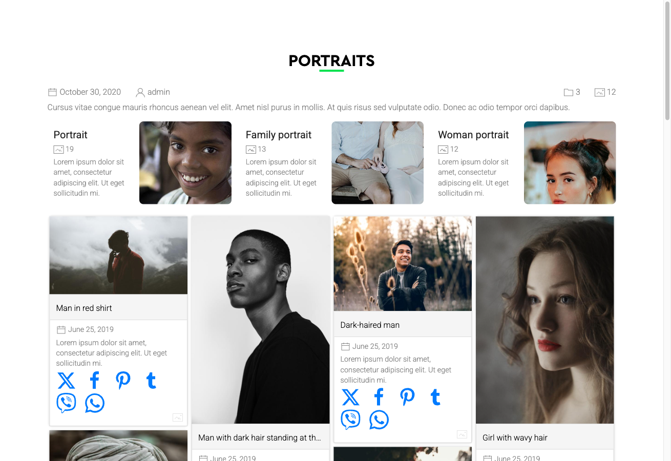
Note: If your gallery contains images that are all the same aspect ratio or cropped to uniform dimensions, the Pinterest layout will appear visually identical to a regular grid. The design shows its strength with genuinely varied image proportions.
Activating the Pinterest Design
The Pinterest template is included in the main FW Gallery package. Install it through the FW Gallery Add-ons panel — do not use the WordPress plugin manager directly.
Once installed, you can activate it at three levels:
- Global default — Go to Settings → Galleries → Default design and select Pinterest. This applies the design to all galleries unless overridden.
- Per gallery — Open a specific gallery's settings and set its design to Pinterest, overriding the global default for that gallery only.
- Per menu item — Set the design on an individual menu item to control how a specific gallery page displays.
Layout Coverage
The Pinterest template provides styled layouts for all major display contexts within FW Gallery:
- Gallery category pages (the primary waterfall grid view)
- Single file detail pages
- User Section pages
- Module displays
Customising the Appearance
The template's CSS can be edited directly in Settings → CSS. Use this editor to adjust column spacing, card styling, typography, or any other visual property without modifying core template files. Changes made here are preserved across updates.