 FW Gallery – Documentation
Pinterest Design
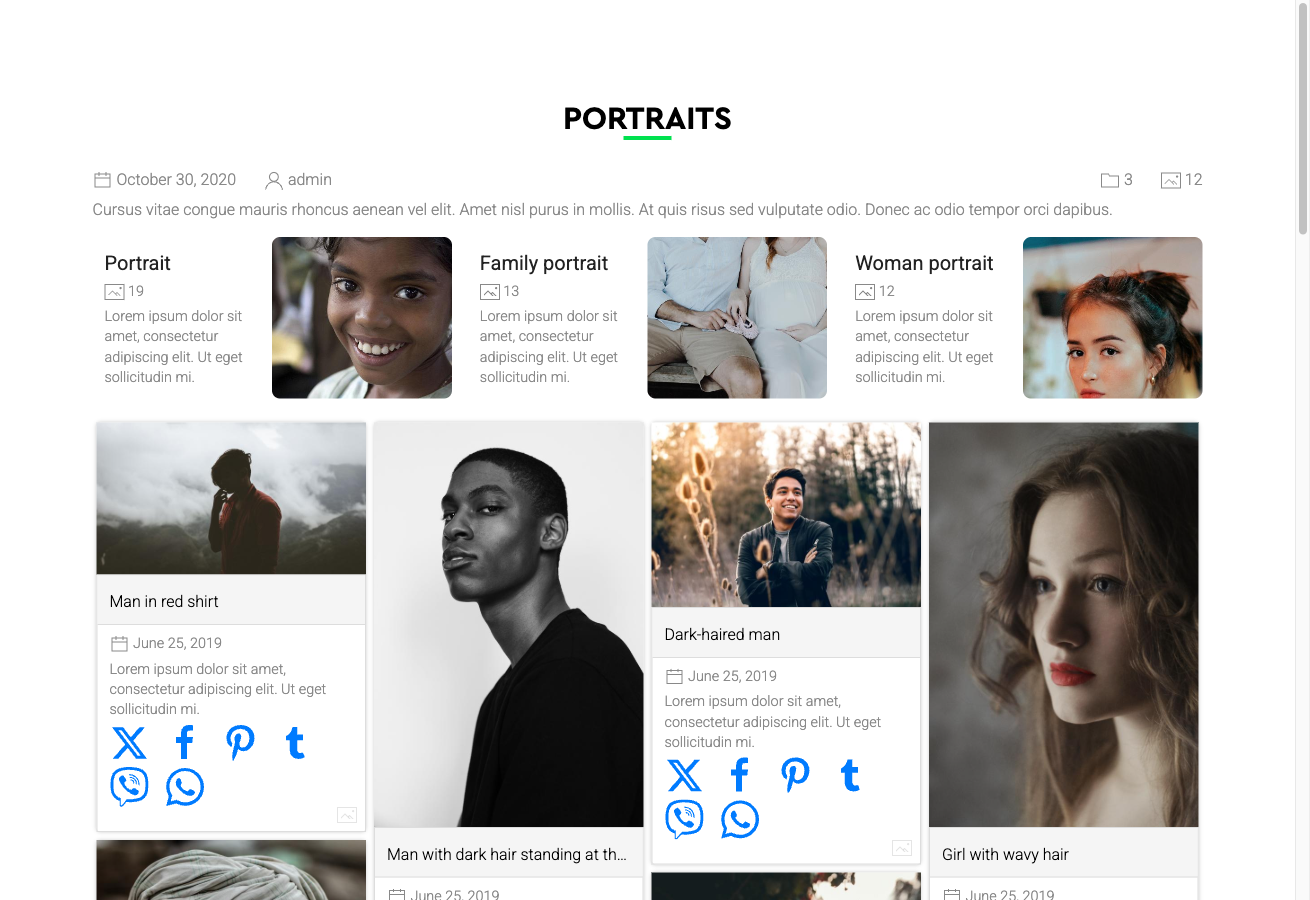
The Pinterest Design template gives your gallery a masonry waterfall layout — multiple columns of equal width but variable height, so each image occupies exactly the vertical space its aspect ratio requires. The result is the characteristic staggered, Pinterest-style grid that works especially well for collections with mixed portrait, landscape, and square images.
Visual Style
- Multi-column waterfall grid with variable item heights
- Card-style presentation with the image title displayed below each photo
- Smooth reflow when the browser window is resized
- Responsive column count — fewer columns appear on smaller screens automatically
For best visual impact, use this template with images that have genuinely varied aspect ratios. If all images are square or nearly identical in proportion, the result will look similar to a regular grid.
Activating the Pinterest Design
The Pinterest Design is included in the main FW Gallery package. Install it through the FW Gallery Add-ons panel — do not activate it manually through the Joomla Plugin Manager.
Once installed, you can apply the Pinterest design in three ways:
- Site-wide default: Go to Settings → Galleries tab → Default design and select Pinterest.
- Per gallery: Open the individual gallery's settings and choose Pinterest as its design.
- Per menu item: Override the design in the menu item parameters for any gallery page.
Where the Layout Applies
The Pinterest template provides styled layouts across all major display contexts:
- Gallery category page — the main waterfall grid view
- Single file detail page
- User Section pages
- Module displays
Customising the Appearance
The template's CSS can be edited directly inside FW Gallery. Go to Settings → CSS to open the built-in editor and add or override any styles. This keeps your customisations separate from the template files and preserves them through updates.
The Pinterest layout is visually similar to the Cascading layout, but the Pinterest template is a self-contained design theme with its own complete styling — choosing one does not require the other.